Microsoft | Power Pages
Shipped: Private Preview launch October 2021
Power Pages was the first Microsoft product I had the pleasure of taking part in building. The beauty of this project was that while some Microsoft products can be more mature, Power Pages was relatively new - leaving room for tons of innovation and reimagining of what is possible for Microsoft as an experience and brand. It was exhilarating to be a part of an established company, yet still operate in an agile manner with a globally distributed team. We were able to push the boundaries of the product to the height of our visual and UX standards, without being weighed down by legacy design patterns. I continue to be both humbled and proud of the work we did as a team - especially in light of the complex interactions and ambitious deadlines.
Goal
The ultimate goal of Power Pages 2.0 was to empower more everyday users to create dynamic, data-integrated solutions that transform their businesses. The metric our team used to define success was to digitally accelerate growth by 3x after the 2022 public release.
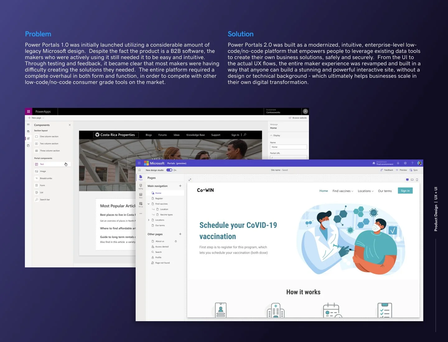
Problem
Power Pages 1.0 was initially launched utilizing a considerable amount of legacy Microsoft design. Despite the fact the product was a B2B software, the makers who were actively using it still needed it to be easy and intuitive. Through user testing and feedback, it became clear that most makers were having difficulty creating the solutions they needed. The entire platform required a complete overhaul in both form and function, in order to compete with other low-code/no-code consumer grade tools on the market.
Solution
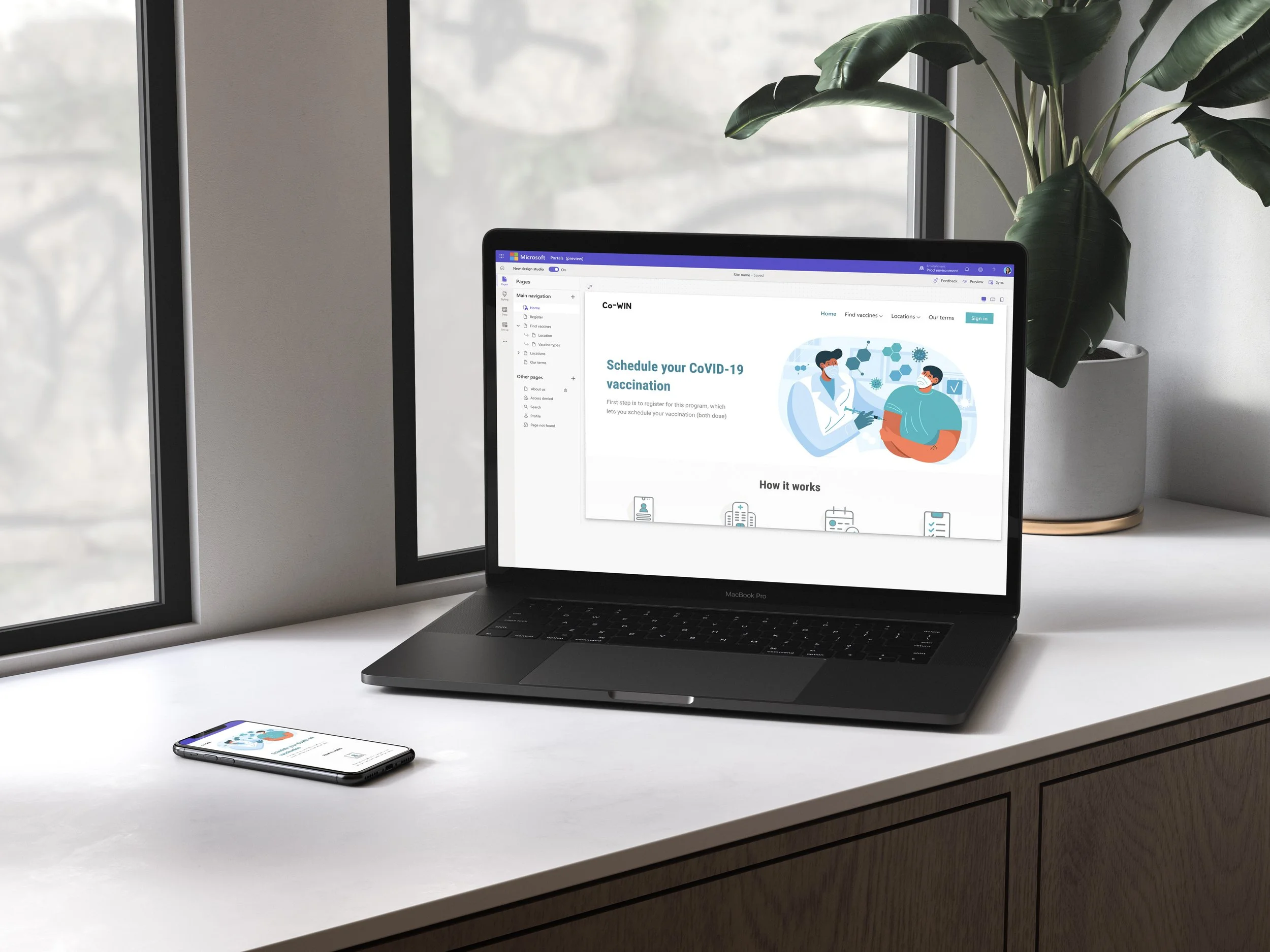
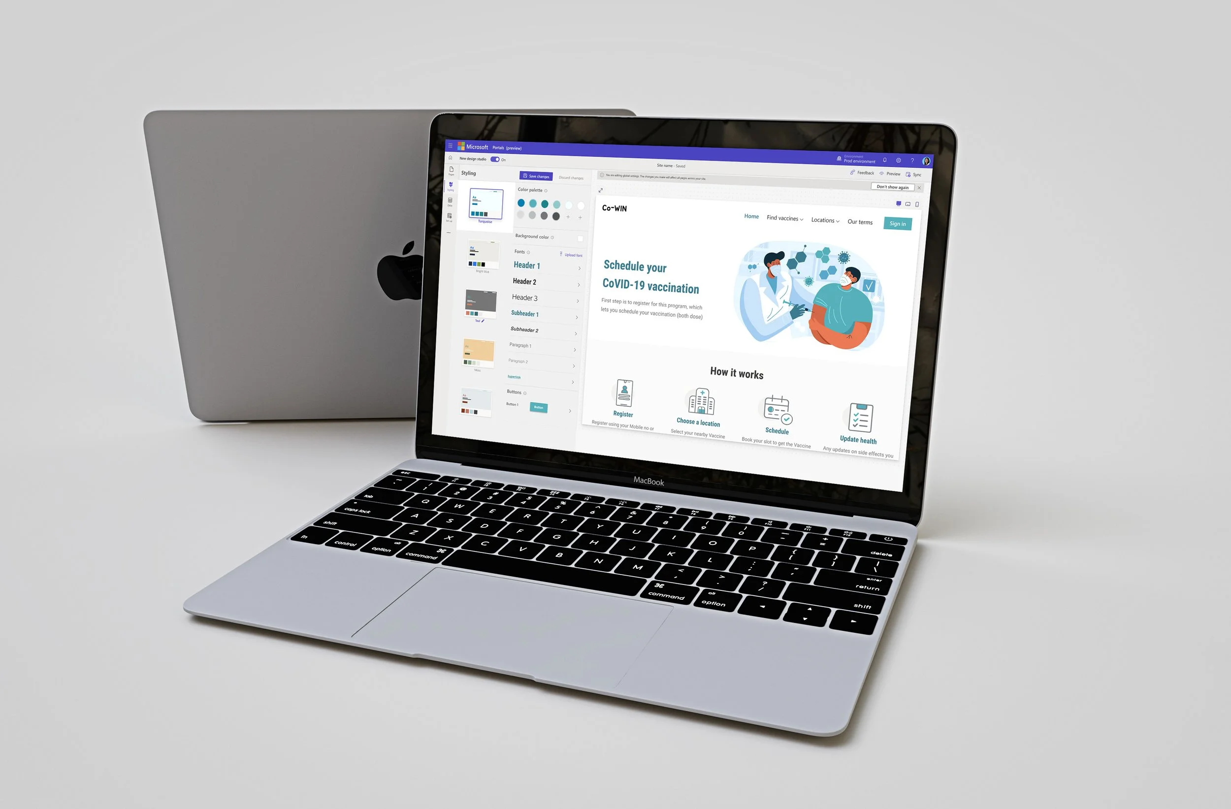
Power Pages 2.0 was built as a modernized, intuitive, enterprise-level low-code/no-code platform that empowers everyday people to leverage existing data tools to create their own business solutions, safely and securely. From the UI to the actual UX flows, the entire maker experience was revamped and built in a way that anyone can build a stunning and powerful interactive site, without a design or technical background - which ultimately helps businesses scale in their own digital transformation.
Introduction
Power Pages initially was launched as a secondary feature under the umbrella of the more mature Power Apps platform. However, once there was significant data showing that enterprise clients were actively using this feature to rapidly build their own sites, Microsoft decided to launch Pages 1.0 (FKA Portals) as its own stand alone product.
The first launch was pushed out rapidly utilizing predominantly legacy Microsoft design patterns - which quickly became a problem as the product gained momentum and reached over 35.2 million monthly active users in 2021 (102% YoY). The platform was highly sought after and showed promise, but our users were having an incredibly hard time navigating the experience and unable to complete their goals. Oftentimes, massive time was lost creating workarounds for the inherited and stale workflows.
The 2.0 launch was set to revitalize the entire experience and help the product look and feel modern, familiar, intuitive and easy. Most importantly, the key differentiator for Pages 2.0 wass the ability to leverage CDS data and easily integrate data components from sources such as Excel and Power BI - giving the product a powerful edge over existing consumer grade tools on the market.
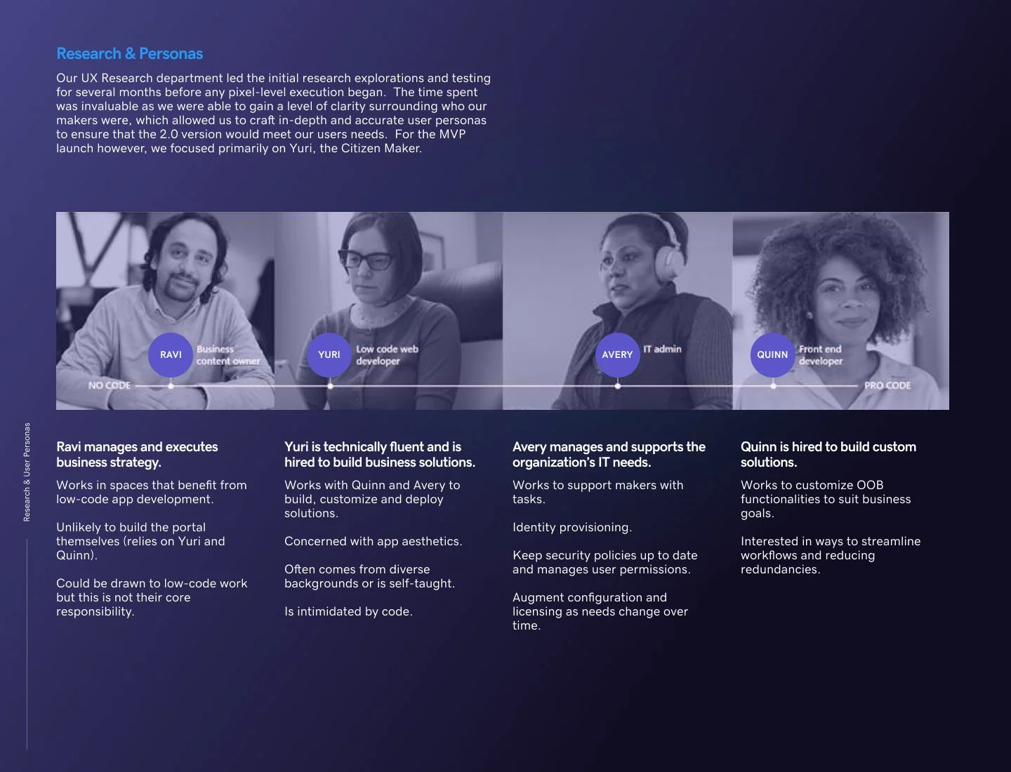
Research & Personas
We were fortunate to have an entire research arm that we could lean on and collaborate with through the entire design process. The initial UX research explorations were conducted for several months before any pixel-level execution began. The time spent was invaluable as we were able to gain a level of clarity surrounding who our makers were, which allowed us to craft in-depth and accurate user personas to ensure that the 2.0 version would meet our users needs.
User Personas
There were a total of 4 primary personas, each with their own expertise, needs and workflows.
Ravi - Business Owner
Yuri - Citizen Maker (Low code)
Avery - IT Administrator
Quinn - Front end developer (Pro code)
For our MVP launch however, we focused on one primary persona, Yuri, the Citizen Maker. Yuri is technically fluent and is often hired to build business solutions for their company. While Yuri is concerned with app aesthetics, they are often intimidated by code. Yuri is self-taught and familiar with other consumer grade low-code/no-code software on the market, such as Squarespace or Wix. With this background, Yuri’s belief is that creating a beautiful and powerful website should be intuitive - and that the software itself should do most of the heavy lifting.
UX & Visual Explorations
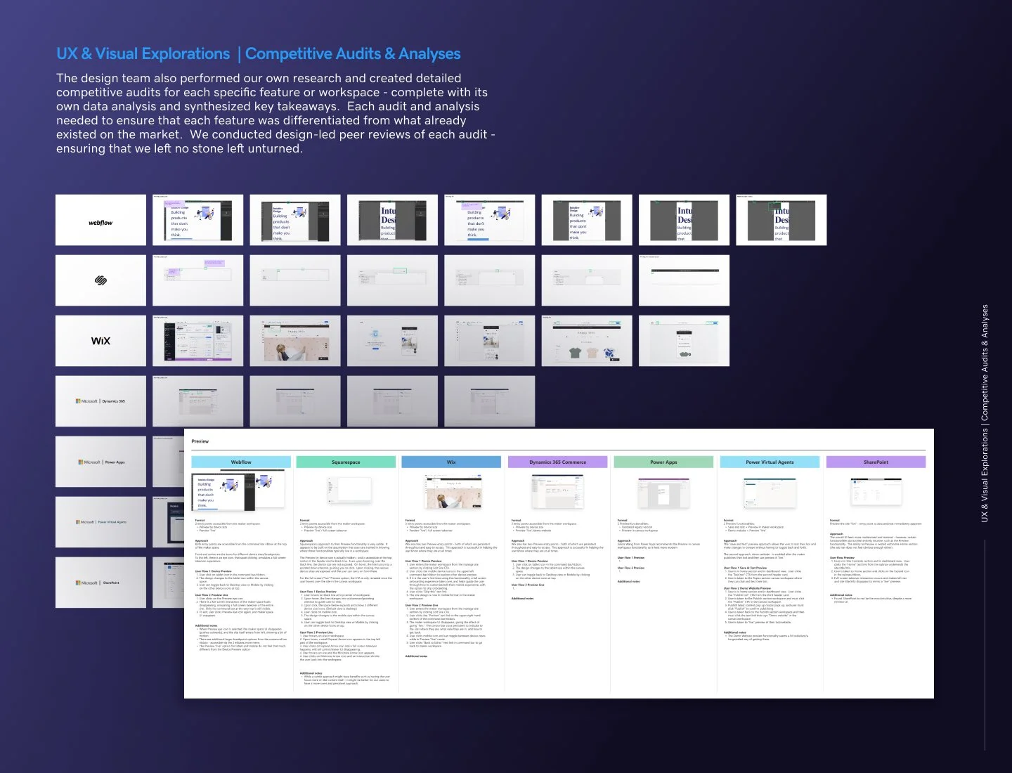
Competitive Audits & Analyses
In addition to the months of in-depth research and testing by our UX research team, the design team also performed our own research and created detailed competitive audits for each specific feature or workspace - complete with its own data analysis and synthesized key takeaways.
Each audit and subsequent analysis needed to make sure that each feature was differentiated from what already existed on the market. We had design-led peer reviews of each audit, to provide transparency and be inclusive of every teammate's input and knowledge - ensuring that we left no stone left unturned.
Our competitive audits normally covered the main B2C low-code/no-code competitors on the market, such as Squarespace, Webflow and Wix. However, we also brought in alternative products depending on the feature at hand, such as Bubble or Framer. Lastly, we always made sure to include an internal audit of different Microsoft products as well, to maintain brand consistency and incorporate the ability to leverage any design patterns and code that have been tried, tested and true.
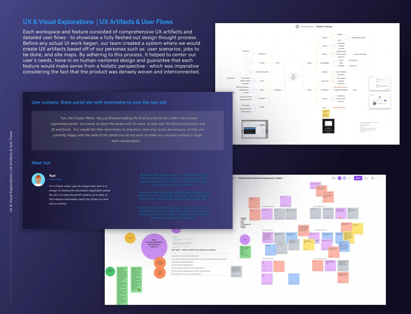
UX Artifacts & User Flows
Each workspace and feature consisted of comprehensive UX artifacts and detailed user flows - to showcase a fully fleshed out design thought process. Before any actual UI work began, our team created a system where we would create UX artifacts based off of our personas - such as: user scenarios, jobs to be done, and site maps.
By adhering to this process, it established consistency around our design methodology. Creating each artifact helped to center our user’s needs, hone in on human-centered design and guarantee that each feature would make sense from a holistic perspective - which was imperative considering the fact that the product was densely woven and interconnected.
My primary area of focus, the Maker Studio workspace, contained numerous complexities that were interdependent on other areas of the product. The workspaces and features I led such as the Pages navigation, Preview and Share - all required quite a bit of mental dexterity and meticulousness to ensure that everything was accounted for and made sense from every entry point.
Collaboration within the design team was imperative to tackle the more complicated features - which often included design reviews, mind mapping and innovation sessions. This focus on collaboration was a cornerstone in our team’s process to address all gaps and generate the best solution for our makers.
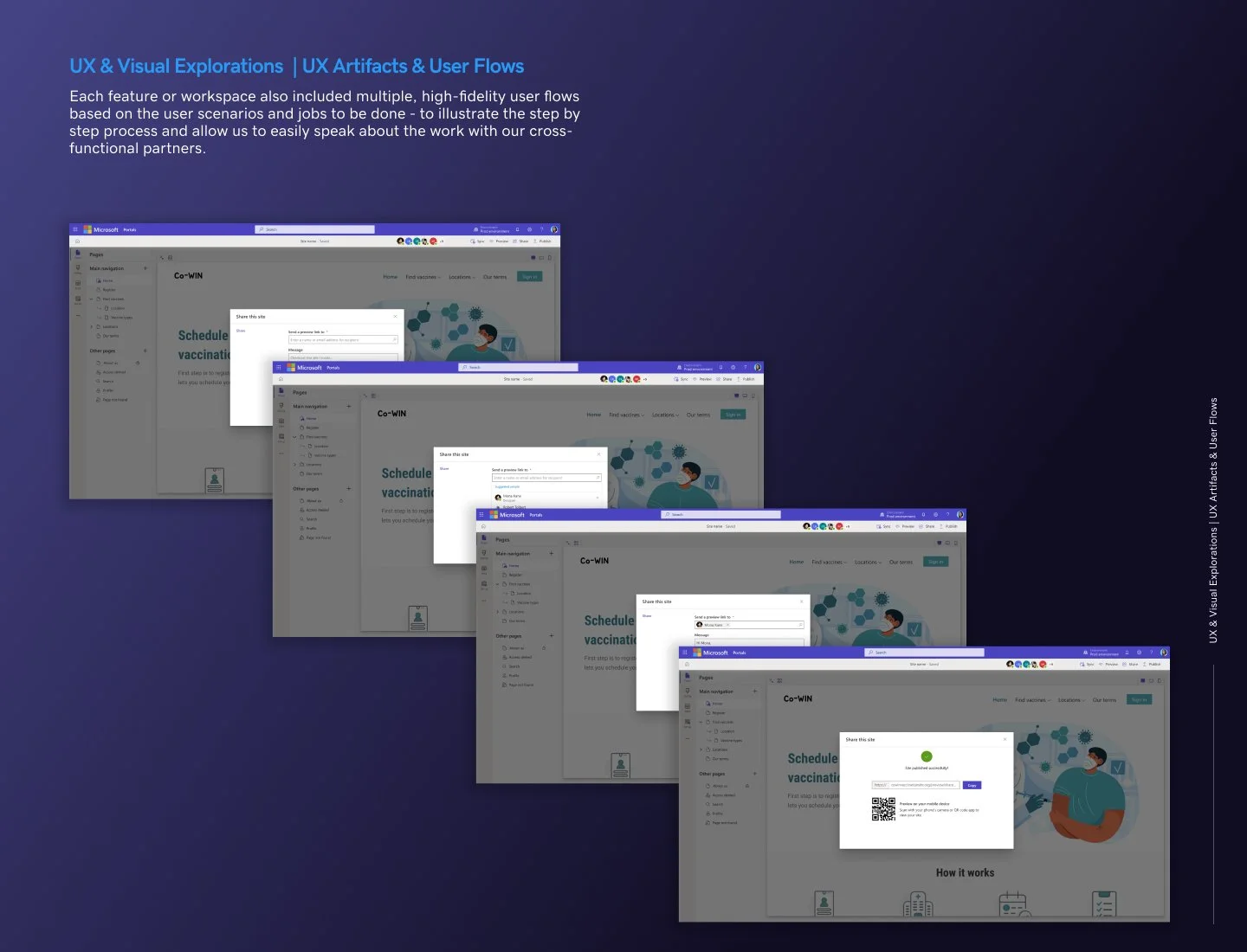
Each feature or workspace also included multiple, high-fidelity user flows based on the user scenarios and jobs to be done - to illustrate the step by step process and allow us to easily speak about the work with our cross-functional partners.
Design Systems
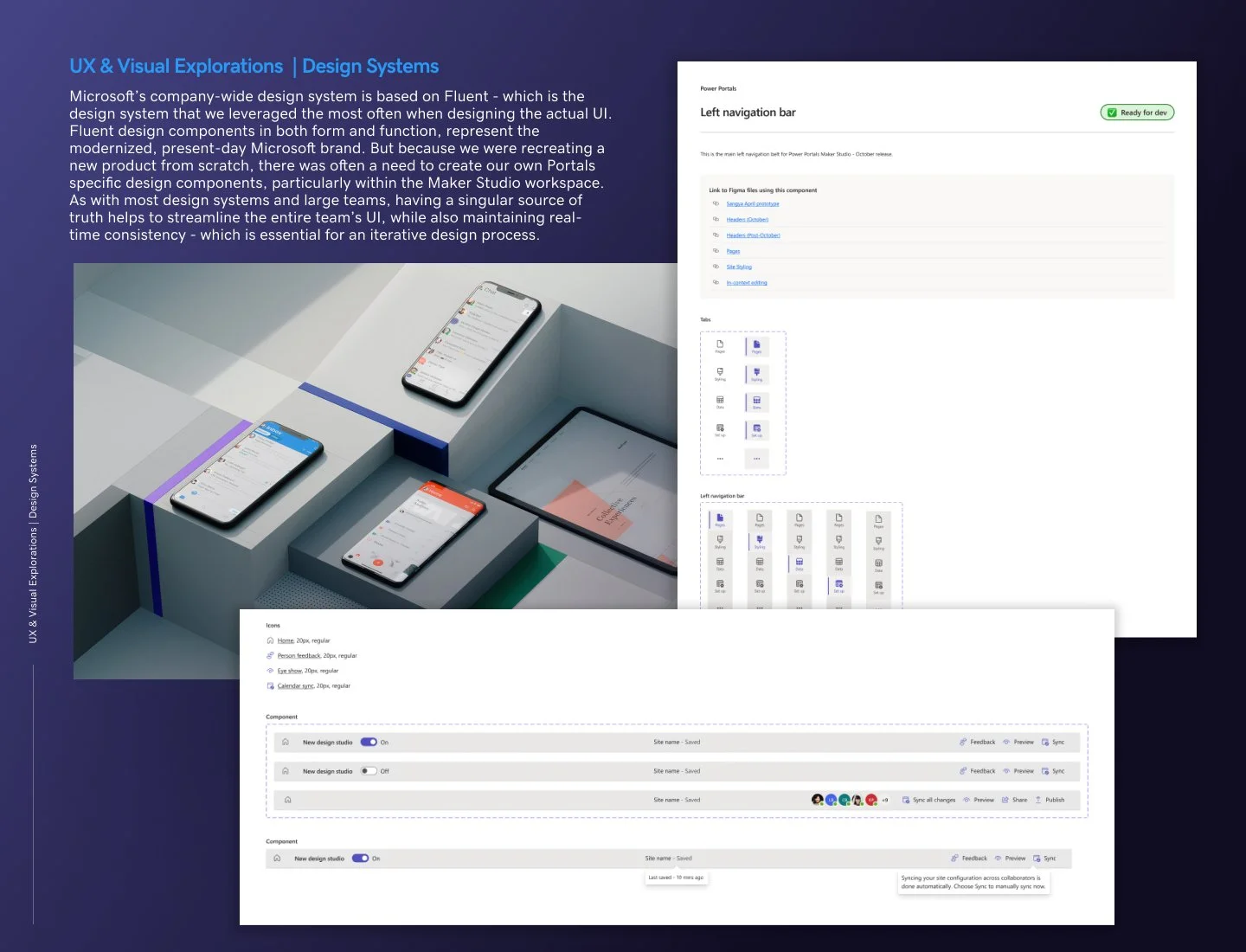
Microsoft’s company-wide design system called Fluent - was the design system that we leveraged the most often when designing the actual UI. Fluent design components in both form and function, represent the modernized, present-day Microsoft brand. Therefore our primary aim from a visual design perspective, was to ensure that Pages 2.0 reflected a Fluent design experience.
That being said, because we were recreating a new product from scratch, there was often a need to create our own Pages specific design components, particularly within the Maker Studio workspace. I largely spearheaded that endeavor, as I spent the most time handling the UI for the Maker Studio. A great deal of effort went into building components and their variant states to provide the most comprehensive components possible.
In addition to the actual components themselves, a teammate also suggested we provide ample documentation within our Design Library. We formatted the documentation inspired by her past experience with the Microsoft Power Automate team. The documentation included all of the actual links to each Figma file that utilized each component, as well as providing detailed alternative user flows and edge cases.
As with most design systems and large teams, having a singular source of truth helps to streamline the entire team’s UI, while also maintaining real-time consistency - which is essential for an iterative design process.
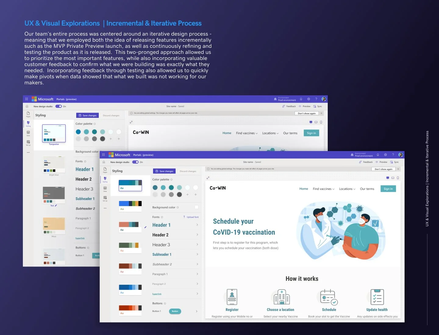
Incremental & Iterative Process
Our team’s entire process was centered around an iterative design process - meaning that we employed both the idea of releasing features incrementally such as the MVP Private Preview launch, as well as continuously refining and testing the product as it is released. This two-pronged approach allowed us to prioritize the most important features, while also incorporating valuable customer feedback to confirm that what we were building was exactly what they needed. Incorporating feedback through testing also allowed us to quickly make pivots when data showed that what we built was not working for our makers.
An example of this instance applies to our Site Styling workspace. For our first launch, there were quite a few gaps in our users’ mental models of how this section should function. The main issue was that there were many interaction details that confused our users and prevented them from easily creating their site. It was such a large list of fixes that this entire workspace required a bit of an overhaul. My design partner in India and I tackled this 2.0 relaunch together to further refine the experience.
An area that I will focus on pertains specifically to the use of site themes, their thumbnail representation in the workspace, and technical constraints from the engineering side. While it may seem small, it is small details like this one that all add up and either enhance or detract from the user experience.
I did research and ended up creating 3 different versions of the thumbnails. Each version represented a different focus - a literal interpretation of how the theme would map on the template itself, a focus on just the colors and fonts themselves, and a version that represented an actual “theme.”
Both design and our PM counterparts were stumped as to which version would perform best. We ended up creating prototypes for user testing to validate which of these thumbnail versions worked best for our makers.
Engineering handoff
The handoff to the engineering team was often a work-in-progress since our team was so new. Overall though, we did follow an agile methodology and thus would hand-off as work as they were completed.
Prior to the “official” handoff, we would have feature syncs to walk through the work to allow the engineering team to wrap their minds around it and provide any questions or feedback they had. This “no surprises” approach was especially beneficial when working with our IDC (India time zone) engineering team, so that the valuable time we had with them was not wasted. The PST and IDC time zones only overlap for a handful of hours each day, so it was critical that both teams used this time wisely.
I would often work side-by-side with our engineering partners in the PST time zone for more synchronistic, detailed iterations on the product. As both team’s development process unfolded, we were all slowly gravitating towards a workflow that paired designers and engineers that were in the same time zone. This gradual, seemingly inevitable development process allowed both teams to produce their best work in the allotted time frame we had.
Announcement at Build 2022
Power Pages was finally unveiled by CEO Satya Nadella at the Microsoft Build 2022 conference - introduced as the fifth product in the Power Platform suite. I have so much gratitude for being able to work on such an impactful product with such smart, driven and talented teammates. It really took a village.
Since that time, I have transferred to another Power Platform product. But I still look forward to partnering and collaborating with the Pages team as they continue to innovate, grow and delight millions more Microsoft customers.