GoDaddy | UX, UI + Motion
Shipped June 2021
I had the incredible opportunity and pleasure of designing end-to-end on the Venture Forward City Portal project - kicking off with research, conducting user interviews, creating personas and wireframes - through to building the design system, animation and development documentation for hand-off. It was a stimulating and complex project, and I was grateful to be a part of it and utilize a multi-disciplinary approach to problem solve throughout the course of the project.
Goal
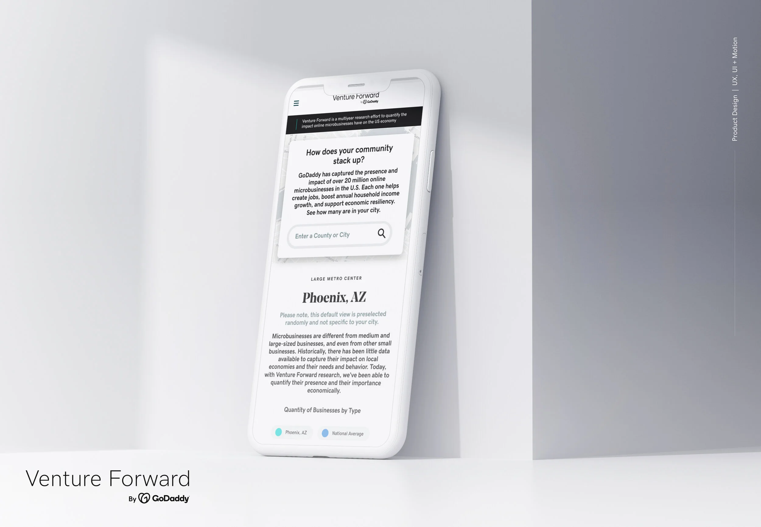
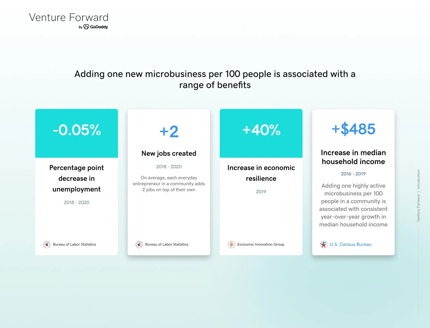
The main goal for the City Portal page was to showcase and validate the importance of having flourishing microbusinesses in your city, and how in turn, this leads to expanded benefits for your city at large - including increased median household income, decreased unemployment rates and new job creation. The main demographic we targeted were elected city officials, city council members, mayoral teams and academics who influence public policy.
Problem
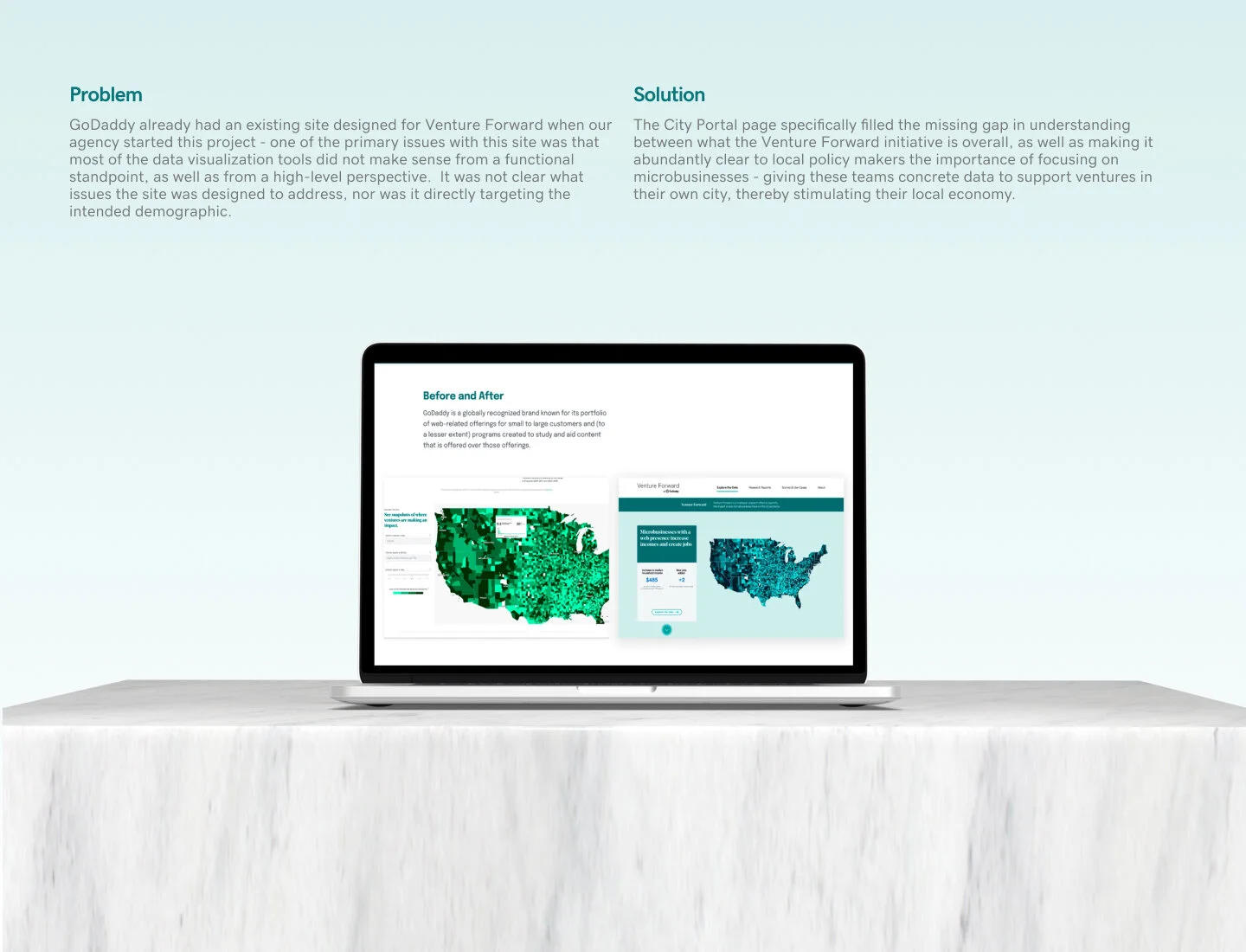
GoDaddy already had an existing site designed for Venture Forward when our agency started this project. One of the primary issues with the previous site was that most of the data visualization tools and analytics did not make sense both from a functional standpoint, as well as from a high-level perspective. It was not clear what issues the site was designed to address, nor was it directly targeting the intended demographic.
Solution
Our team partnered with GoDaddy’s data scientists and copywriters to make the analytics more approachable and intuitive - by creating easily digestible data interpretations for the users who need to leverage them most, without compromising important details. The City Portal page specifically filled the missing gap in understanding between what the Venture Forward initiative is overall, as well as making it abundantly clear to local policy makers the importance of focusing on microbusinesses - giving these teams concrete data to support ventures in their own city, thereby stimulating their local economy.
Introduction
Venture Forward is one of GoDaddy’s newest initiatives - a multi-year research project which measures and quantifies the positive impact of microbusinesses across the United States. The research and data dive deep into the net effect microbusinesses have on their local communities, as well as how they strengthen the U.S. economy as a whole. These analytics will likely continue to be pivotal information, as the country recovers from the economic fallout from the COVID-19 pandemic.
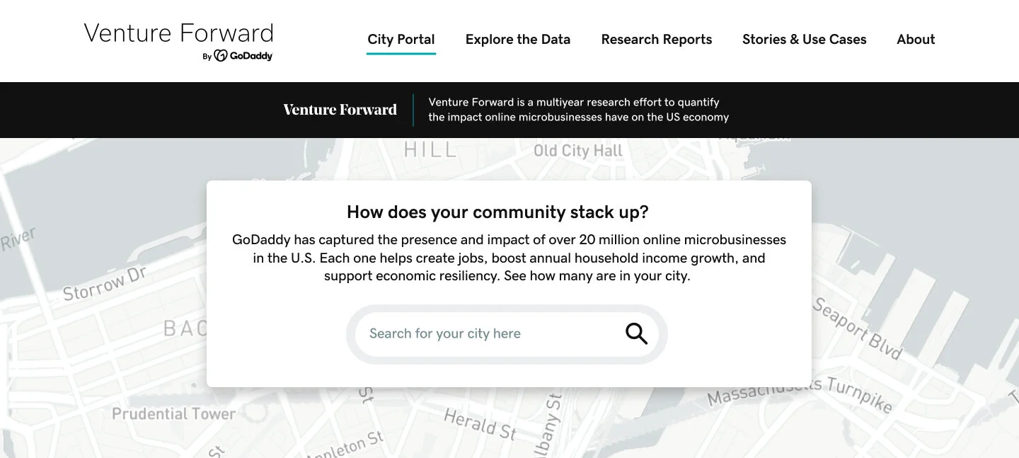
This was an interesting project - the City Portal section was of particular importance to the GoDaddy team - calling it the “crown jewel” of the Venture Forward site. These new datasets are the first to illuminate the voluminous impact of a previously invisible class of 20 million microbusinesses, or ventures, across the country. These microbusinesses, defined by GoDaddy as businesses that are 1-9 employees in size, have long since been overlooked by policy makers and ignored in national debates, as the income they generate have not been captured by traditional economic data methods.
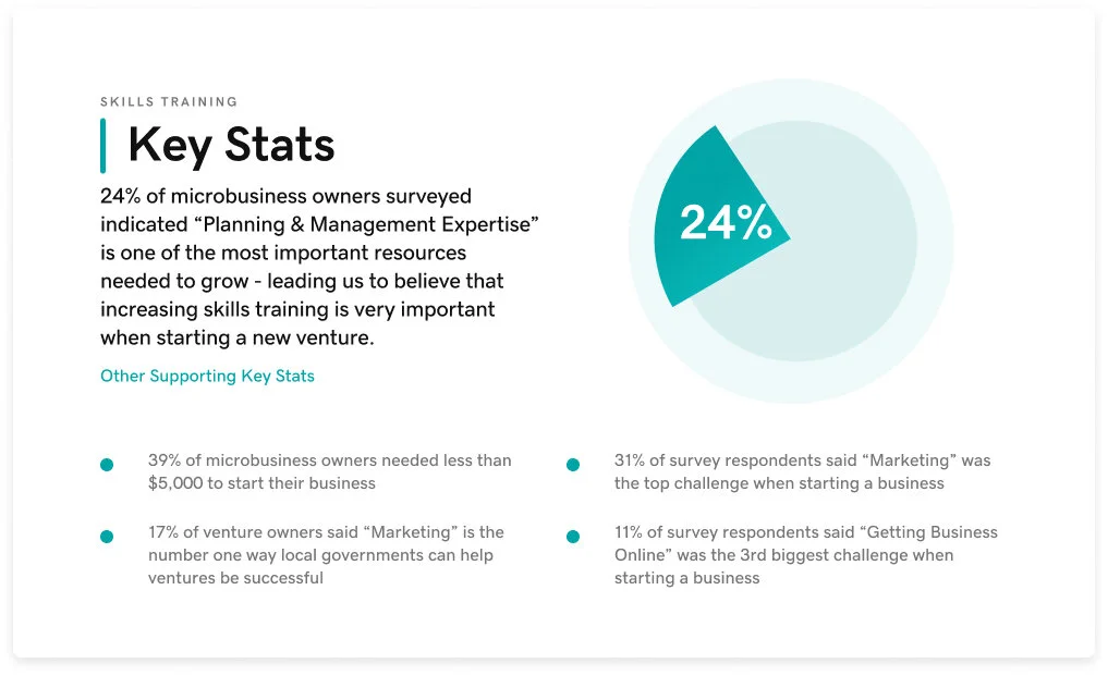
GoDaddy is hoping that by making Venture Forward available to the public, anyone - from elected officials, academics, to think tanks - can utilize the incredible wealth of data and work to address issues like financial inequality, immigration, and job skills-training.
Research
One of the initial challenges of this project was understanding what our target demographic’s habits, needs and use cases would be. I did not have much prior knowledge of city council work, nor did I fully understand how public policy is shaped. Through the research process, I realized how vital their jobs were to all of our lives, and how obscure it was to find out any information about their day-to-day workflows or how their decision making process is typically conducted. It appeared that most of this industry was not well-documented online and that most policy decisions were handled either via in-person meetings or through bureaucratic, internal organizations.
Luckily the scope of this project allowed our team to be able to properly conduct user interviews - which was extremely insightful to both validate certain findings, as well as informing us what we needed to throw out or re-direct our focus to. For instance, initially, our team internally brainstormed and were given a very prominent, technocratic mayor, Francis X. Suarez from Miami, as a proposed primary user by the GoDaddy team. This led us to believe that the ability to share information via social media would be a fairly high priority. Through the initial research stages, it did appear that mayors, a handful of prominent city council figures, and tech-savvy academics were in fact utilizing social media on a regular basis. Additionally, due to the pandemic - it seemed like overall, more information and thought sharing was migrating online.
Interviews & User Personas
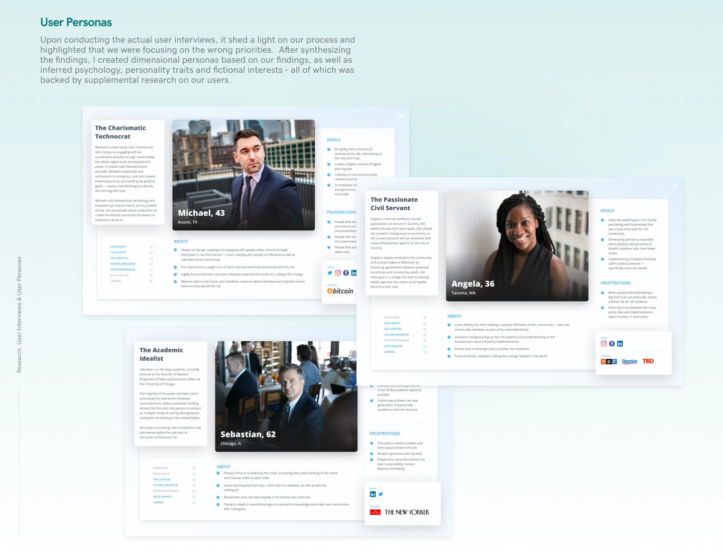
Upon conducting our actual user interviews however, it became immediately clear that social media played almost no part of any of our participants’ day-to-day business. Our interviewees held very different positions within the spectrum of the demographic we targeted - from a non-profit grant writer, an economic developer, to a city manager - yet each person specifically stated that social media functionality would not be a necessary tool. Our team reconvened and agreed we were focusing our priorities on the wrong functionality and features.
What our interviewees actually wanted and needed was an easier, more intuitive site where they can leverage raw data to support their specific project aims. Our interviewees’ workflow regularly consisted of conducting research and crafting unique presentations to support a specific policy. More precisely, all of the participants regularly cited data from the U.S. Census - a highly credible source, but also an extremely hard site to navigate.
Once the interviews were complete, my team and I synthesized our findings and determined the top user types that would be relevant for the City Portal page. I then moved on to creating the user personas, utilizing the MoSCoW method, while bringing additional dimension to the personas with personality traits, inferred psychology, and fictional interests - all of which was backed by supplemental research on our users.
The user personas went through several rounds of iteration, as they were a highly integral part of the process - internally for our agency team, as well for the GoDaddy team themselves. Ultimately, we all wanted to make sure we did our due diligence to ensure that this time, the site directly spoke to the intended demographic.
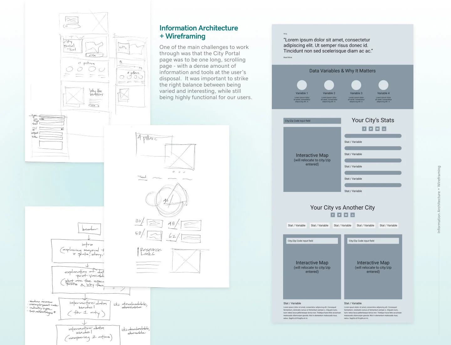
Information Architecture + Wireframing
One of the primary challenges to work through when creating the initial information architecture was that the City Portal page was proposed as one long, scrolling page - with a dense amount of information and tools at the user’s disposal. I also had to keep in mind that the original site’s IA did not tell a story in a compelling way - the information was laid out in a way that did not create a cohesive sense of understanding. I needed to strike the right balance between being varied and engaging, while still being highly succinct and functional for our users.
My initial approach was utilizing pen to paper, thinking exclusively in terms of the actual content without any visuals at all. This bare bones approach helped me to clearly prioritize the information better, and highlight what exactly needed to be showcased.
Once the information architecture was approved, I was able to move on to wireframing and laying out design patterns that may work. A challenge here was finding ideal design patterns - as most of the referenced sites were lacking in that aspect. Sites our interviewees referenced, such as the U.S. Census, Grant Watch, and Kids Count - did not appear to prioritize the user experience of their sites.
I did extensive visual design research from comparable industries - including academia, social sector agencies, and government websites. From there, I synthesized patterns and layouts that would create enough visual interest, while still maintaining a feeling of intellectual credibility.
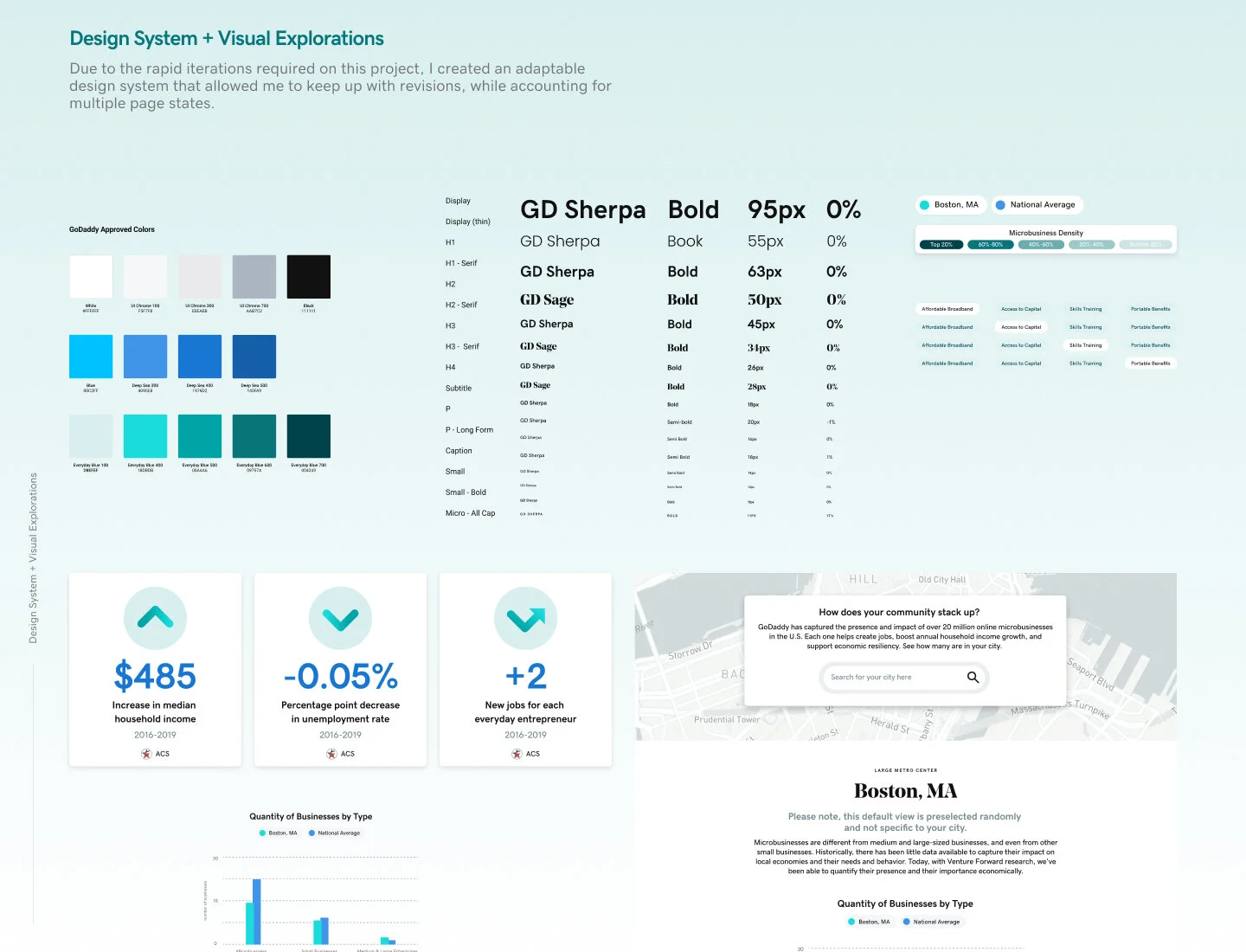
Design System & Visual Explorations
We went through countless iterations in the design process and with so many stakeholders involved, we also faced many shifting priorities - which then in turn affected the functionality within the designs. Due to the rapid iterations, I created an adaptable design system that allowed me to keep up with the revisions, while accounting for multiple page states. This required a fair amount of organization upfront, but ended up paying dividends throughout the course of this project.
We had a string of failures - though each one provided essential learnings. The first issue we faced was having to condense our initial idea of having an entry point page, which subsequently led into the main city portal section. While from a user flow standpoint this may have helped set the stage better for the user, due to the tight deadline, having two pages to build instead of one, would detrimentally impact our development timelines. It was therefore unanimously vetoed even though we had designed it to a highly polished stage after many rounds of iterations.
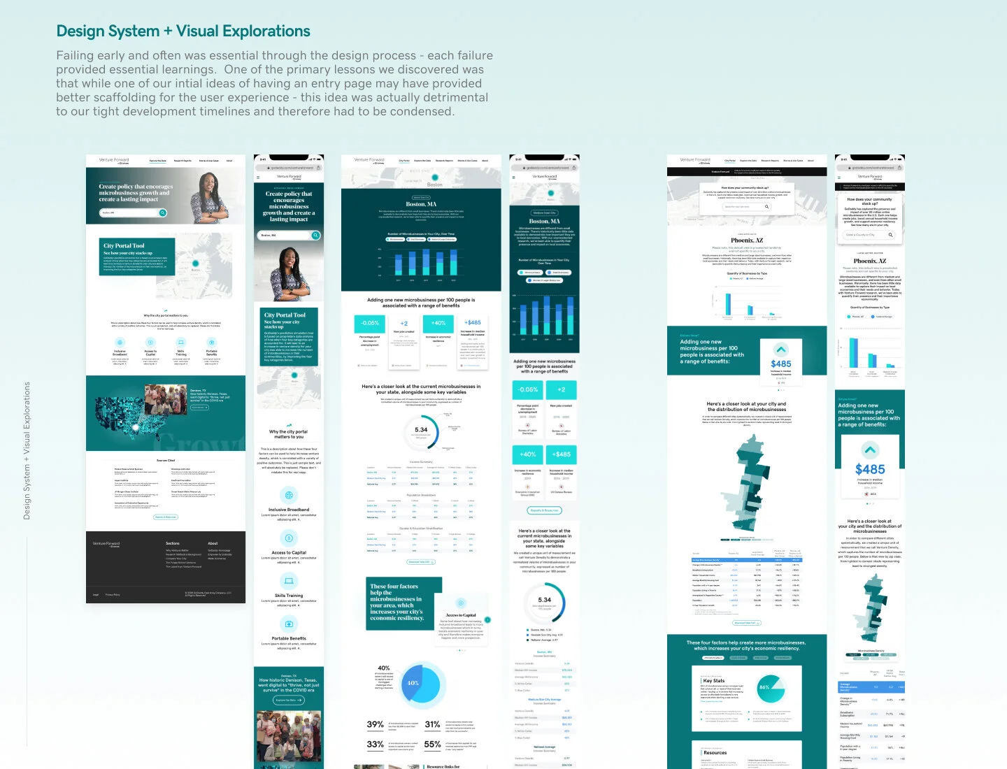
Another issue that continued to surface as feedback from the GoDaddy team was to ensure that the site did not feel like a marketing site. Due to the incredibly valuable proprietary data that Venture Forward wanted to showcase, it was imperative for us to stray away from being too playful.
At the beginning of the project, we were given inspiration references that were more progressive, though as the project evolved, the feedback on the designs scaled most of the visual interest back. I actually did understand this approach, as my personal design practice involves pushing a visual concept as far as possible first, and then through iteration as a group, stripping the design back to only what is essential. I feel that it is oftentimes easier to edit out flourishes, rather than have something so minimal, which can sometimes be hard for clients to articulate what exactly needs to be added.
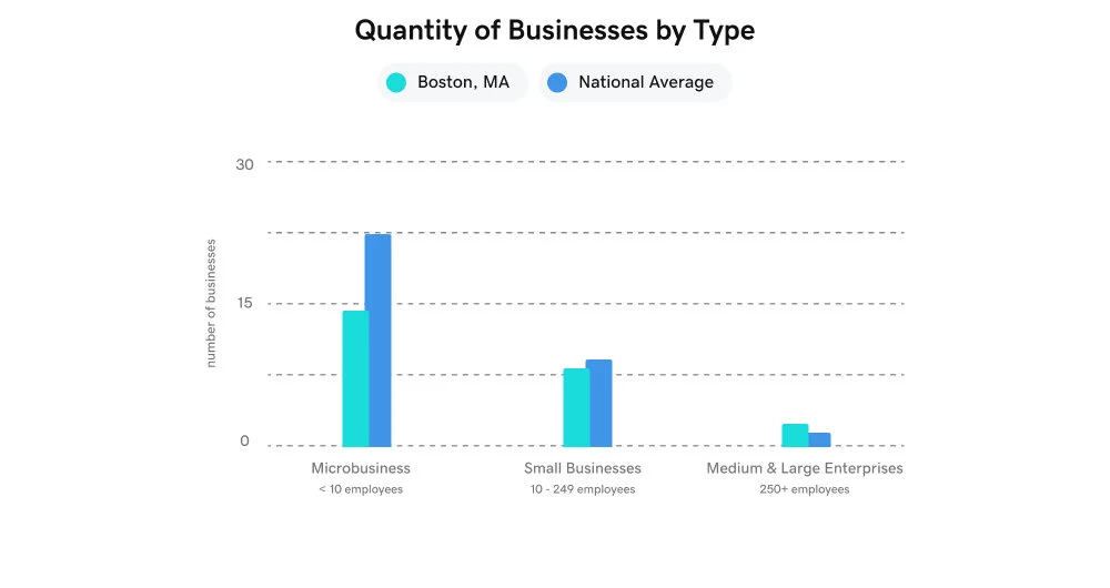
Initially the data visualization ideas, while visually compelling, felt a little too abstracted - to the point where it was not immediately clear what the main takeaway from the data was. The solution here was to simply use standard bar graphs and tables - so that the data was easily ingestible to anyone. I also incorporated one two many colors - which ultimately, the color palette was pared down immensely from GoDaddy’s Brand Team.
In the end, we reached a place where the mockups looked on-brand, functional and ultimately served the overarching goal: targeting our primary user base. We received executive sign off from the GoDaddy team and were able to move to the motion & development hand-off phase.
Motion
I felt lucky that the scope of this project allowed me the space to utilize my motion skills. Not only that, but I had the opportunity to get paired up with one of our most senior development team members, who specializes in front-end animations - by working so closely with him, I was able to refine my motion skills even further and also learned quite a bit on how to best help create a complex asset that is usable and easy to implement on the development side.
Because most of the interactions would be involving the CMS, a good deal of the animations I created were for proof of concept. There were a handful of places within the site where I was able to create assets that exported directly as JSON files - saving our dev team 90-94% more coding time. Through this project, I’ve learned to not only understand the limitations on the design side, but also on the technical constraints on the development side.
From a higher level perspective, I always enjoy working through interactions/motion on this scale, because it helps to sharpen my UX thinking. By breaking each step down into detailed microinteractions, it helps to further my empathy for the users.
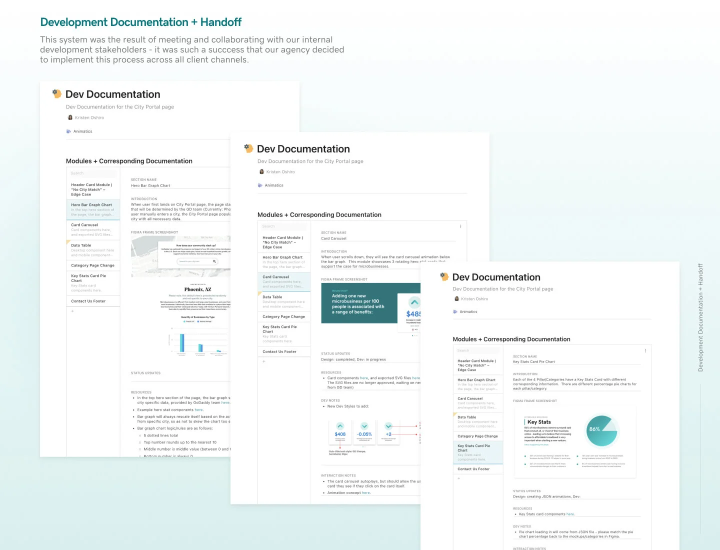
Development Documentation & Hand-off
Once the final animations were buttoned up, I moved on to the development documentation process. I created a documentation system for making annotations within Figma, as well as externally documenting on Coda. This system was the result of collaboration with our internal development stakeholders - it was such a success that our agency decided to implement this process across all client channels.
I enjoyed working so closely and collaboratively with our development team - hearing their pain points and frustrations helped me to understand how I could bridge the gap better between design and dev. Through this iterative process, I felt confident that we had synthesized a solid foundational system that had both teams’ needs accounted for.
Conclusion
Designing and shipping this project end-to-end was an incredibly insightful experience - one that allowed me to fully flex my range of motion as a designer, and I continue to be so grateful to have had the opportunity to collaborate with such a talented team. It was compelling to see how much the product shifted and evolved and it truly is a testament to Aristotle’s quote, “the whole is greater than the sum of its parts.”