

Flip Fit’s Social Shopping platform blends the power of social media with the buying appeal of e-commerce. The fitting room is flipped into the living room, where they try on everything and share photos on the Flip social platform to get a thumbs up or down from friends on what looks best.
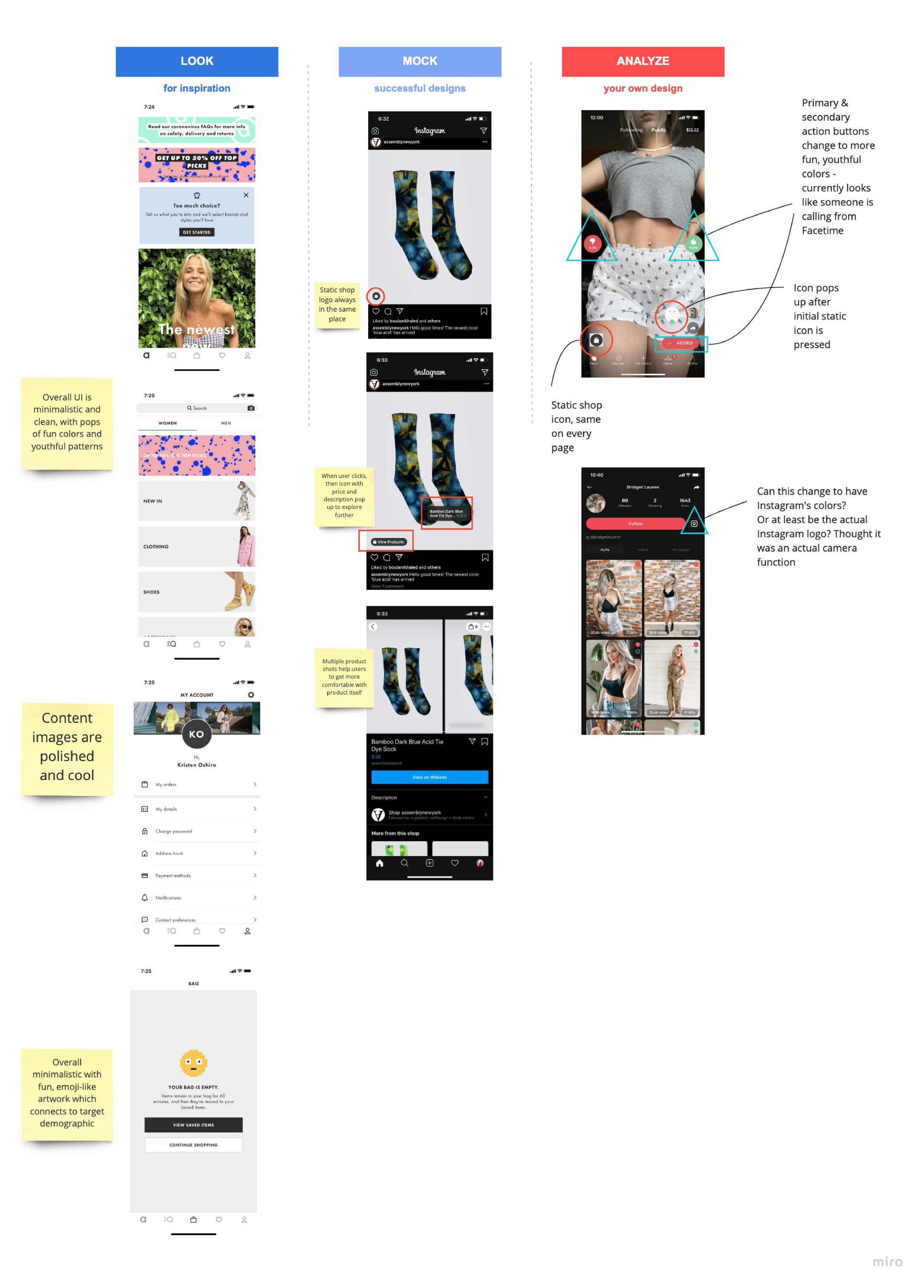
When I first joined Flip Fit, I created a quick virtual whiteboarding presentation where I touched on a few ideas that could help to improve the experience - both visually and usability wise.
Because of my fashion background and being an avid online shopper myself, I felt I had some insight on how to improve the e-commerce experience.
I did some quick competitive research on e-commerce sites and apps that have successfully captured the demographic that Flip Fit desires, such as ASOS and Instagram.
By highlighting the elements that are successful in these apps, I was able to illustrate a quick side-by-side comparison and analyze Flip Fit’s current user experience and where there might be room for improvement.
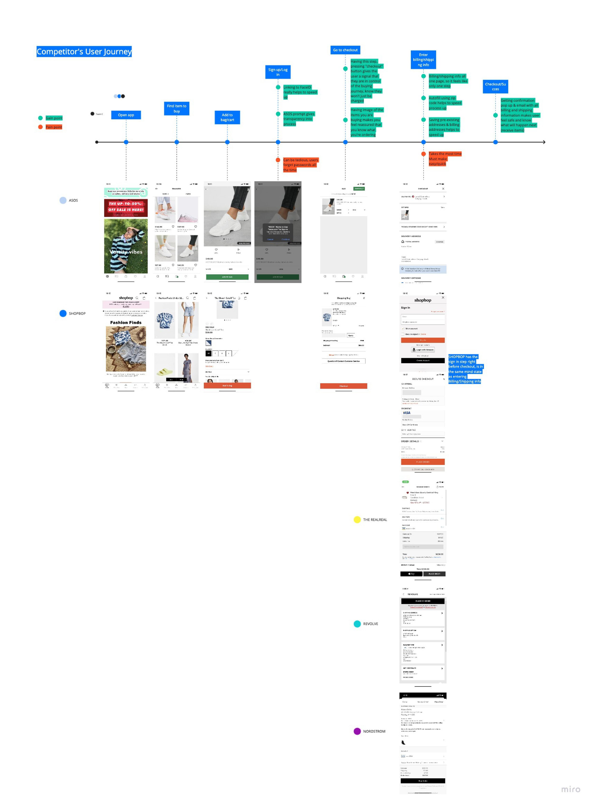
Subsequently, I was tasked to analyze the e-commerce aspect of the app and pinpoint the exact areas of disengagement. Below I created a customer journey for a typical successful e-commerce experience - illustrating that there are very few steps between the impulse to buy and actually purchasing.
Additionally I illustrated the Flip Fit customer journey to show how it differs, however, for confidentiality reasons, I have kept that portion offline.
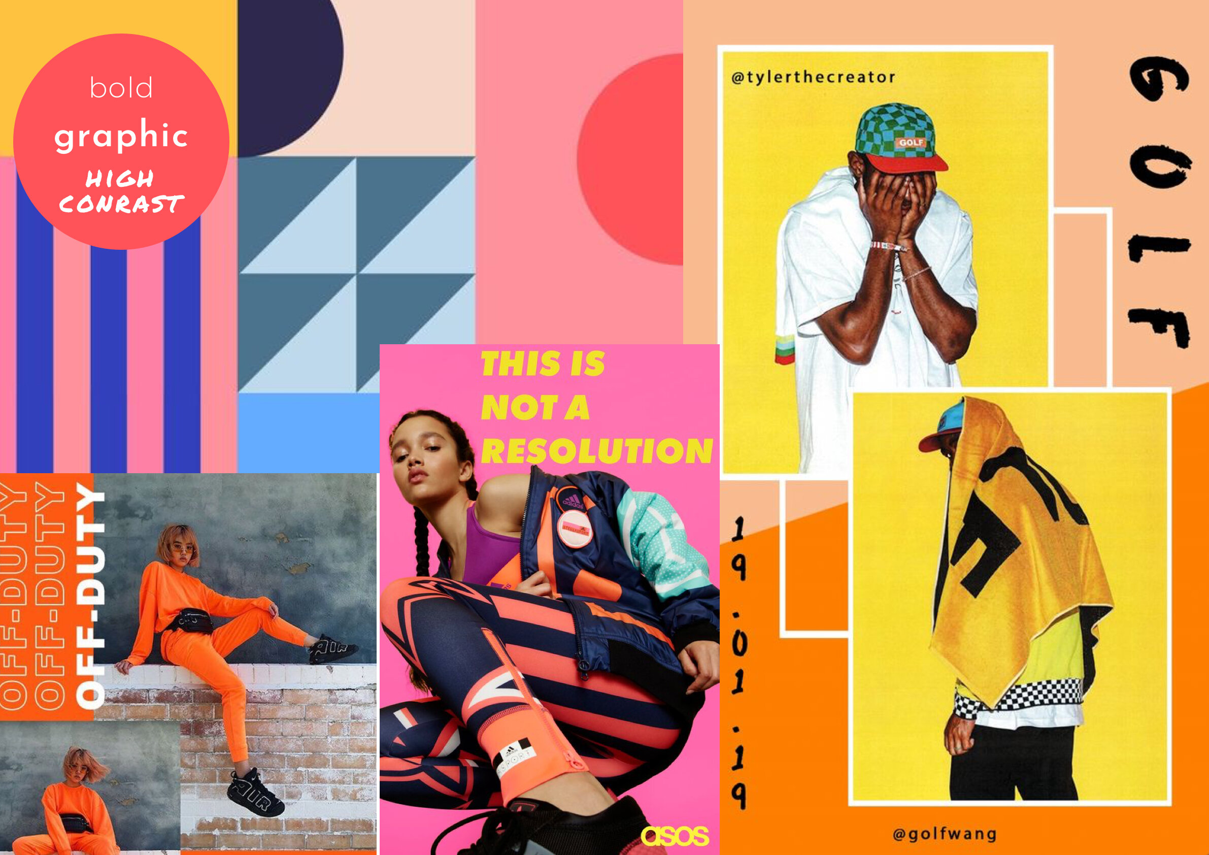
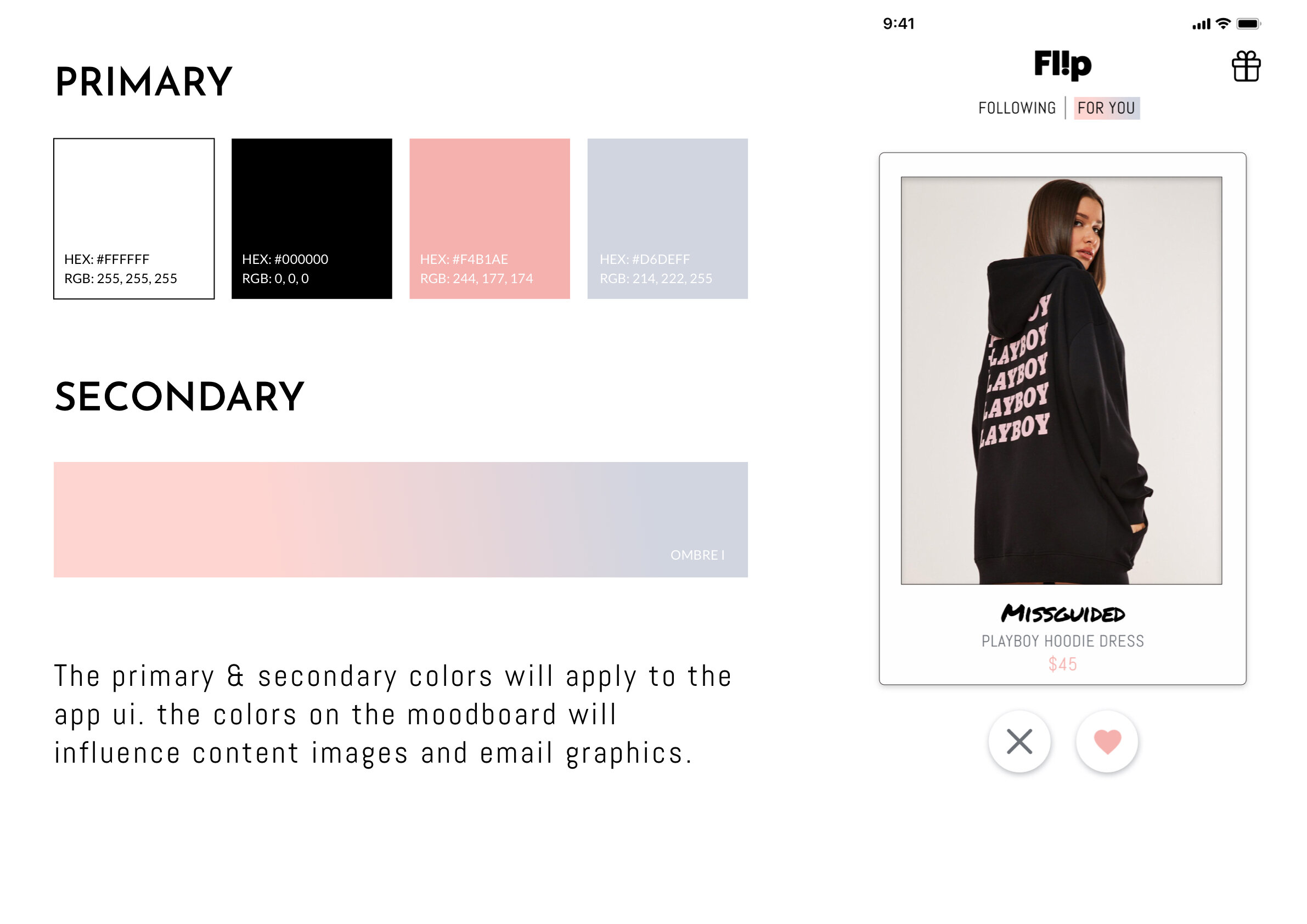
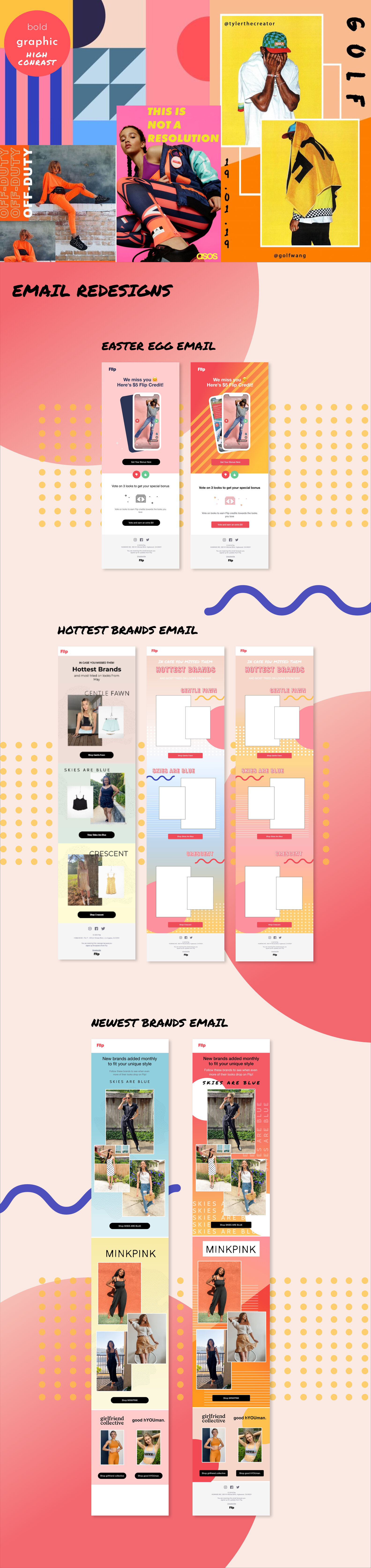
I was also asked to ideate and come up with a few potential rebranding options. After some more in depth research of successful e-commerce competitors (ASOS, Missguided, Shein) I presented the two different mood boards below.
Both aesthetics were synthesized based also on additional trend research and analysis of the target demographic.
The main feeling I wanted to convey with both rebranding options was a feeling of freshness, youth, vitality and fun.
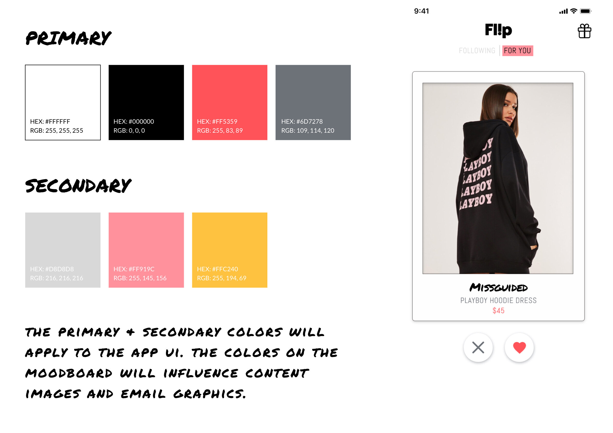
Mood board 1 was more of a bold, graphic approach, while Mood board 2 captured a more “e-girl,” light and whimsical touch. Ultimately we moved on with the first option as it lends itself better to a more unisex appeal.
Based on the new direction, I redesigned several email template blasts to match the new look and feel.