Product Designer
vibe-tile 2.jpg

Microsoft | vibe.powerapps.com

Power Apps Vibe NDA
Microsoft Power Apps · vibe.powerapps.com

Building the Team While Building the Product

Product
vibe.powerapps.com
Role
Design Lead, team of 8Vision, strategy, 0‑1
Shipped
Oct 2025Private PreviewNov 2025Public Preview
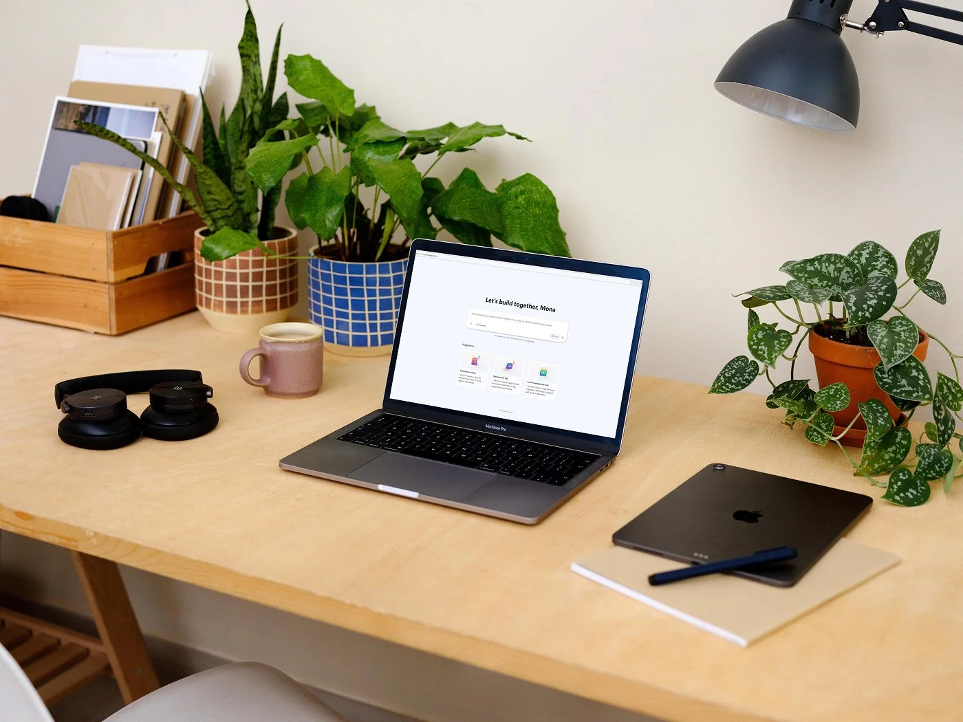
The vibe.powerapps.com home page: a greeting that reads Let's build together, a prompt box for describing an app, and suggested starting points.
Context

A new team, a new product, a new way of building

In August 2025, a major reorg reshaped the Power Apps organization, and I stepped in as Design Lead for the newly formed Developer Agents team. Nothing existed on day one.

There was no inherited design, no established product surface, no settled team structure, and no shared definition of what "good" looked like. The business had decided to pivot from legacy Power Platform experiences due to their pre-agentic backend architecture, which was riddled with complexity and outdated code. A 0-to-1, AI-first product built on an agentic harness would let the organization ship faster, experiment in production, and learn from real customer data. It laddered directly up to Charles Lamanna's white paper, Changing How We Build.

The mandate was bold: an enterprise-grade app-building experience where four specialized agents, Requirements, Data, Solution, and Code, work together to turn a maker's intent into a functional, enterprise business app. The window was about three months, with Private Preview on the PPCC keynote stage in October and Public Preview at Ignite in November.

My role went beyond owning a slice of UX. I led design, content, and user research strategy for a team of eight designers, and I was accountable for the coherence of the end-to-end experience: aligning designers across parallel workstreams, connecting design direction to Product and Engineering realities, and helping a brand-new team find the rhythm and confidence to ship together.

Tension

Defining the product while building it

The core challenge was ambiguity at speed. The organization had shifted overnight to a start-up mentality of shipping fast and asking forgiveness later. Every decision sat somewhere between the deadline and the quality bar.

PPCC Ignite AugSepOctNov Time leftThe barRoom to get it right
Illustrative · Less time, a higher bar: we sped up and raised quality at once

Four things were in motion at once.

  1. 01The team was new→
  2. 02The product was undefined→
  3. 03The technology was emerging→
  4. 04The quality bar had changed shape→
01

The team was new

Ownership across a matrixed Design, PM, and Engineering organization was still being worked out after the reorg. We'd previously relied on formal structure: experience reviews, ship room reviews, and leadership buy-in at each gate. The pressure of the moment called for something far more agile and fluid, and nobody had built that muscle together yet.

02

The product was undefined

We had to decide what the experience was while building it. Information architecture became the crux. We landed on three primary buttons: Plan, Data, and App, and how a maker moved between them shaped everything else. I led the information architecture myself as a super IC. It absorbed many rounds of iteration, backed by rapid user research, and a lot of churn from leadership before it settled. What shipped was welcomed by customers and senior leadership alike.

End-to-end flow diagram: a multi-turn golden path from Home to natural-language input, first-run experience, App or Plan, then Save, Publish and Share, with editing paths for App, Data and Plan edits branching below.
The end-to-end flow helped the team reason about the IA: one golden path from prompt to publish, and the editing paths a maker could take through App, Data, and Plan.
03

The technology was emerging

We were learning in real time what generative models and multi-agent orchestration could reliably do. Design couldn't stop at the interface. We had to understand model behavior closely enough to know which experiences we could promise customers and which needed to wait.

04

The quality bar had changed shape

AI changed what quality meant. A beautifully designed interface could still produce an inconsistent generated app, so "good" had to cover far more than the screens we drew.

Good had seven sides.

A beautiful interface covered two of them. The other five lived in what the agents generated and how they behaved.

Early evaluations were candid about the gap. An early November model evaluation described the initial app-generation scores as "quite red."

So Design leaned in across the end-to-end model evaluation process, taking a holistic, multi-pronged approach to reach the highest model quality we could. Before output, design taste briefs shaped what the models generated. After output, through Projects Crucible and Chisel, designers ran offline human reviews of generated apps and established research-backed UX evaluation criteria to improve the computer-use agent's output. We partnered closely with Engineering to build internal grading tools too, including a side-by-side app arena where reviewers voted between generated apps. Together, this moved the conversation about model quality from opinion to evidence.

We weren't just designing screens. We were helping define what good meant for an AI system whose orchestration, outputs, reliability, and UX all had to work as one.

Model evaluation process: pre-output visual prompting through design briefs feeds post-output grading, from a basic validation test to computer-use agent evaluations, then human grading in an explorer tool and a side-by-side App Arena comparison tool, with grading looping back to inform the input.
Design shaped the end-to-end model evaluation process, bringing a multi-pronged, holistic approach to how the models were judged.
Turning Point

Build the system around the work

Rather than trying to solve every problem myself, I focused on creating clarity at every level. Four moves became the operating system behind the product.

01

Set a shared north star

I used design storytelling and tangible prototypes to align cross-disciplinary partners on one end-to-end vision, which gave each workstream a larger narrative to build toward. I presented it at the Power Platform planning session, where it drew applause; Leon Welicki, VP & GM of Power Platform Core, called it "stunning" and "very well done." That early buy-in made collaboration and execution smoother across Engineering and Product. Inside the team, I led a values-based brainstorm and co-created a team mission statement, so we had shared principles to hold onto when the pace got hard.

The vision gave every workstream the same story to build toward.
02

Create structure inside the ambiguity

I split the team into squads, each owning an area of the end-to-end, and set up triad structures that mapped responsibilities across our Design, PM, and Engineering partners. I traded heavyweight gates for an agile rhythm of six weekly cadences, including Big Picture syncs, Wall Reviews, Quality Reviews, and pair-coding sessions. People could move quickly without stepping on each other.

03

Shrink the distance between Design and Engineering

Through Project Phoenix, we moved away from sequential handoffs. Designers paired in real time with the engineer coding their design, getting pixel-level details right in production code and removing the need for most formal design reviews. Using GitHub Copilot, engineers generated about 20% of production code directly from design mockups, reducing dev cycle time by 15%.

I also mentored the team into designing with generative AI. Figma Make prototypes showed animation and interaction far better than static frames ever could, and they compressed the path from design to production. Multiple engineering managers called the design collaboration the best they'd ever had.

A Figma Make prototype of the progressive loading animation showed how it should move before it was built.
  • ~20%Production code generated from design mockups
  • 15%Shorter dev cycle time
  • 3 → 1Iteration rounds with code prototypes, 66% less churn
  • 6–12×Faster design-to-handoff, internal estimate
04

Make quality everyone's job

Every week, I ran a Weekly Quality Review: a cross-discipline bug bash with most of the design team alongside partners from Product and Engineering, focused on overall product quality. Together we went through the product end to end and examined the UX, UI, content, and interactions, so that whatever we shipped to production met a high quality bar. It made quality a shared habit across disciplines rather than a final gate owned by one reviewer.

UX UI Content Interactions Every week
Design, Product & Engineering A weekly bug bash, not a sign-off.

The whole product, end to end, through four lenses, so whatever reached production met the bar.

  • UX
  • UI
  • Content
  • Interactions
Resolution

From zero to Private Preview to Public Preview

About two months after the team formed, the new experience debuted on the PPCC 2025 keynote stage and opened to customers through an Early Access Program. Demand was immediate.

  1. Aug 2025Team formed after the reorg
  2. Oct 2025Private Preview, PPCC keynote
  3. Nov 2025Public Preview, Ignite
Private Preview · PPCC
  • 234Early Access sign-ups within 24 hours
  • 336Sign-ups by early November
  • 32Strategic partners in the first cohort

“Blown away already. Impressive and polished.”

Early Access customer, Network Rail

“I'm genuinely loving vibing with the experience.”

Ryan Cunningham, CVP, Power Platform, after the PPCC keynote

Treating launch as a learning loop

Private Preview wasn't the finish line. We onboarded participants through a dedicated Teams channel and scheduled structured follow-up sessions, so every week of preview fed the next round of design and model work.

Shipping with eyes open

Moving toward Public Preview meant facing hard reliability numbers head-on. In early November, end-to-end success rates looked like this, with 55 Public Preview bugs tracked and 13 of them P1.

  • Create~73%
  • Edit~89%
  • Save~85%
End-to-end success rate · Early November 2025

At the same time, we stood up vibe.powerapps.com as a standalone surface: domain and service setup, identity, an automated build and release pipeline, regional deployment, partner dependencies, and compliance, all on the path to Ignite.

Public Preview · Ignite
  • 20,000+Visits in the first week
  • 4,300+Monthly active users in the first week
  • 30,000Makers by early December
  • ~7,000New makers week over week
  • ~53%Positive in-product feedback
  • 3Months from blank canvas to Public Preview

In about three months, a newly formed team went from a blank canvas to a product in thousands of customers' hands. The practices outlasted the launch, too: AI-first design, model evaluation, and design-engineering pairing became how the team kept working.

Reflection

Leadership as connective tissue

Starting from nothing taught me that on AI-native products, much of the leadership happens between the workstreams. It means turning ambiguity into ownership, linking vision to detailed execution, making sure separate features add up to one experience, protecting craft while keeping pace, and building ways to measure model quality instead of debating it.

It also changed how I see Design's role. Building AI experiences pulls designers upstream into product framing and downstream into model behavior, evaluation, and implementation. Design can contribute more than artifacts. It can supply the connective system that helps a multidisciplinary organization move as one.

Most of all, it confirmed the kind of leader I want to keep becoming: one who creates clarity without shutting down exploration, drives urgency without losing humanity, and holds a high quality bar while giving others room to lead. At the Developer Agents town hall, my peers nominated me for Growth Mindset and Transformational Leader, recognizing that balance of business needs with grace and compassion.

My biggest contribution wasn't a screen. It was the system around the work,the connective tissue that let a new team ship as one.